While preparing an update of Carbon-Neutrality by 2050 (by far the most accessed page in this blog), I had another look at (equilibrium) climate sensitivity (ECS), a topic about which a wrote a few times before.1 ECS is the expected global temperature anomaly (i.e., the expected global average of warming) at twice the pre-industrial level of greenhouse gases (mainly CO₂) in the atmosphere (i.e., 560ppm, as “pre-industrial” is set at 280ppm). The currently most widely accepted estimate of ECS is that by Steve Sherwood and colleagues, who suggest average warming of 3.1°C (median; 66% uncertainty range: 2.6~3.9°C; 95%: 2.3~4.7°C).2 However, in November last year, James Hansen and a long list of co-authors published a paper with a very different estimate: 4.8°C (95% uncertainty range: 3.6~6.0°C).3
Climate sensitivity (ECS) is an extremely useful tool to make quick (back-of-an-envelope type) estimates of how warm it is going to get in a certain scenario. It can be used as such, because it is typically assumed that the relation between an increase of atmospheric carbon (and other greenhouse gases) and an increase in the average global temperature is roughly linear. Under that assumption, we can just plug ECS in a very simple equation like this:
$$ \Delta T_{anom.}^{(Sherwood)} = \frac {3.1 \times ( C_{atm.} – 280 )} {280}$$ Here, \(\Delta T_{anom.}\) is the expected global temperature anomaly (i.e., the expected global average of warming) and \(C_{atm.}\) is the amount of greenhouse gases in the atmosphere measured as parts per million (ppm) CO₂-equivalent. (The number 280 is the pre-industrial level of greenhouse gases.) This formula uses the ECS estimate by Sherwood and colleagues. If we’d use the estimate by Hansen and colleagues instead, we get:
$$ \Delta T_{anom.}^{(Hansen)} = \frac {4.8 \times ( C_{atm.} – 280 )} {280}$$ With formulas like these, it is possible to roughly estimate the warming effects of sociopolitical or economic changes, for example. Obviously, they cannot replace climate models (in fact, they are based on climate models), but if you’d make a model of the world economy, for example, which gives an estimate of greenhouse gas emissions, then these formulas allow an estimate of the warming effects. Hence, rather than modeling the climate itself, you can model something else, and roughly estimate the effect thereof on climate.4 And in case of the update of Carbon-Neutrality by 2050, I can make a rough estimate of how much warming would result from actually achieving that goal (which is virtually impossible, but that’s besides the point here). However, if there are two formulas, then this becomes a bit more difficult. Not “more difficult” in the sense that it would be technically harder, but in the sense that it drastically increases uncertainty, especially if the two estimates are as far apart as these two.
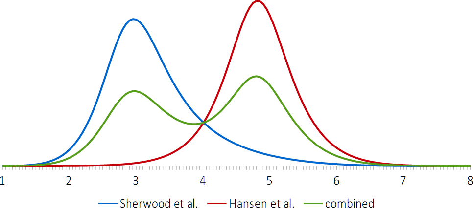
The latter becomes especially clear if you plot the probability distribution of the two ECS estimates in a single graph as shown below. (The surface below the three lines in the graph is equal, because that surface represents 100% probability.) Notice how far apart the peaks in the blue (Sherwood) and red (Hansen) graphs are, and that what is most probable according to one of these estimates, is highly unlikely according to the other, and vice versa.
So, what to do with this? How does one give an estimate for expected global warming at a certain level atmospheric CO₂-e? There are four different answers to this question, I think, but none of them seems to be a particularly good answer.
- You could give two numbers with two uncertainty ranges. So, for example, at 450 ppm, you predict 1.9°C (with 66% uncertainty range 1.6~2.4°C) or 2.9°C (with 66% uncertainty range 2.6~3.2°C). This is a bit weird, mostly because this answer involves non-overlapping uncertainty ranges that add up to more than 100%. In fact, the complete uncertainty ranges of both estimates add up to 200% exactly (obviously).
- You could adjust for this weirdness by answering that there is a 33% likelihood that it will be between 1.6 and 2.4°C; a 33% likelihood that it will be between 2.6 and 3.2°C, and a 34% likelihood that it will be in between those two ranges or below the lowest range or above the highest range. This answer assumes, of course, that both estimates of ECS are equally likely to be correct, which might be a justified assumption if there is no good scientific reason to prefer one of the two. Regardless of that assumption, I would say that this answer is even weirder than the previous answer.
- You could combine the two probability distributions. If both ECS estimates are equally likely to be correct, then the green line in the graph above gives their combined probability distribution. With that combined probability distribution, we can give a single number and single uncertainty range: 2.5°C of average global warming at 450ppm (with 66% uncertainty range 1.7~3.1°C). This looks like an OK answer by itself, but you’d have to ignore what it is based on: the green, camel-shaped curve in the figure above. Summarizing a curve like that in a single number with an uncertainty range seems a bit silly.
- You could pick one of the two ECS estimates and stick with that one, but of course, this way of answering the question would only be justified if there are good scientific reasons to discard one of the estimates as highly unlikely, while accepting the other. (And arguably, even if one of them is 95% probably right and the other 5%, it may be a more technically correct to combine the two probability distributions with those weights instead of the 50/50 weights assumed in answer number 3.)
The last answer would be a good answer if we can indeed discard one of the two estimates. But are there actually good reasons to prefer one of the two estimates? One possible way5 of assessing their likelihood is comparing them to recent data. They’re both based on historical data, of course, but there are many uncertainties involved in that, and there may be circumstances that were very different but that aren’t accurately taken into account. Looking at recent data avoids that kind of problem, but comes with problems of its own (which I’ll ignore here). the following graph has temperature anomaly on the y axis and atmospheric CO₂-e on the x axis and lines in four different colors. Blue is based on ECS according to Sherwood et al (the dotted lines are the 66% uncertainty margins); red is based on ECS according to Hansen et al.; and green is actual data from 1959 to 2023. (The yellow line will be explained below.)
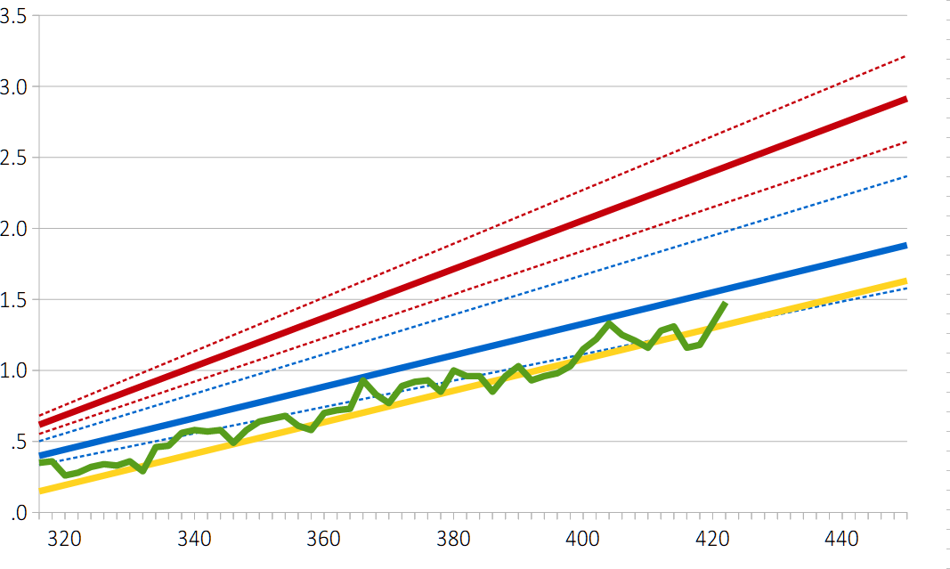 What is, perhaps, most obvious in this graph is how close the Sherwood-ECS-based line (i.e., the blue line) is to real data. The small discrepancy can be easily explained by time lag, “aerosol cooling” (more about that below), or some combination of factors including these two. What raises suspicion, however, is that – knowing that factors like these play a role – the two lines may be too close to each other. You’d expect these factors to create a bigger discrepancy. On the other hand you wouldn’t – or at least, I wouldn’t – expect as big a gap as that between the green and the red lines (i.e., between data and the Hansen-ECS-based line). Hansen and colleagues, however, explain that whole gap with aerosol cooling, as illustrated by figure 13 in their paper:
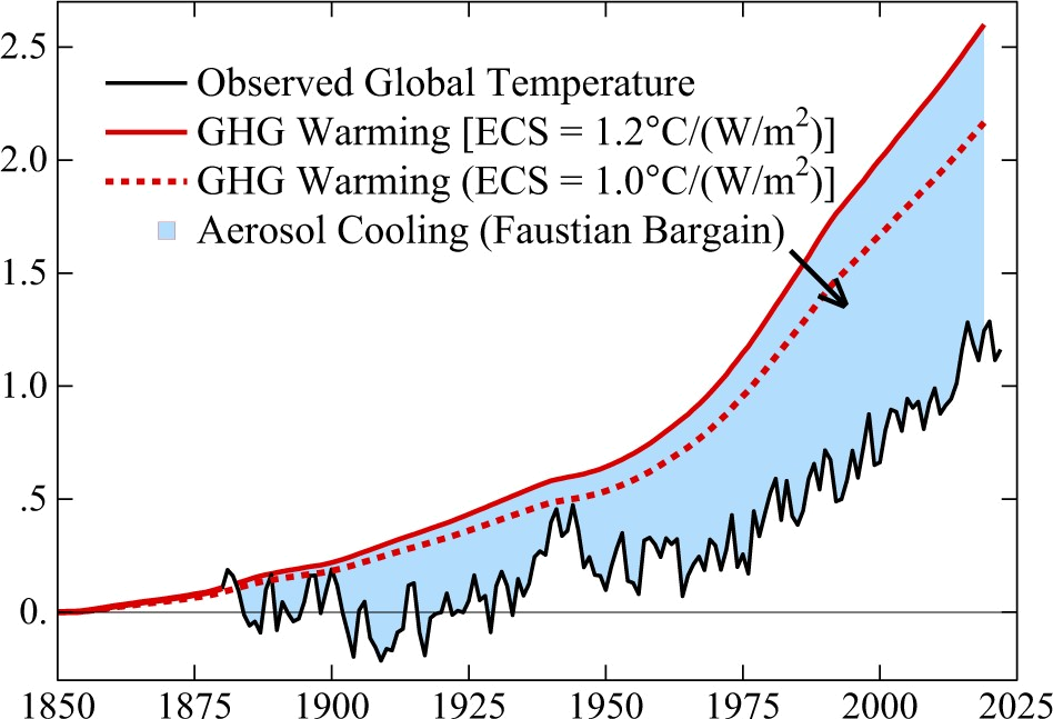 “Aerosol cooling” is the cooling effect by certain kinds of pollutants in the atmosphere. This includes soot, dust, PM2.5, sulfates, and much more. Some of these end up in the atmosphere due to natural processes, but a lot of it results from things we do – a lot of it is of an industrial origin. This stuff in the (upper) atmosphere reflects sunlight, and if less sunlight reaches the surface of the planet, it warms up less. Some proposals for geo-engineering (so-called “solar radiation management”) are based on the same idea, and the “year without a summer” (1816), which gave us Frankenstein among others, was the result of the 1815 Mount Tambora eruption that led to temporary global cooling for the same reason. Now, as far as I can see, there still is no scientific consensus on the size of this effect, so the blue area in the figure above may be an overestimate (or an underestimate, although I think that’s less likely), but regardless, this aerosol cooling effect suggests an important correction to the second formula given above. It should actually be:
$$ \Delta T_{anom.}^{(Hansen)} = \frac {4.8 \times ( C_{atm.} – 280 )} {280} – \psi_{a.s.},$$ in which \(\psi_{a.s.}\)6 represents the aerosol cooling effect. The figure above suggests that \(\psi_{a.s.}\)is approximately 1.3°C or 1.4°C at the moment and that it has been increasing, but there is reason to believe that this increase might not continue and there may even be a (small?) decrease because of the effect of more successful environmental policies. (“More successful” than climate-change-related policies, that is.) The figure shows that without aerosol cooling, it should have been about 2.6°C above pre-industrial in 2022 or so, while I get 2.4°C from the formula without \(\psi_{a.s.}\), so if the cooling effect is an adjustment to that formula, I should probably use hat number, meaning that \(\psi_{a.s.}\) was about 1.1°C in 2022. The figure shows that \(\psi_{a.s.}\) was around 0.5°C or 0.6°C at the end of the 1950s. If it is assumed that there has been a linear increase between 1959 and 2023 (i.e., the period of the data that resulted in the green line), then the result of this corrected formula can be easily added to the figure. Actually, they’re already in the figure – that’s what the yellow line is. But rather oddly, that line is a bit too low – it gives temperature predictions that are slightly lower than what we have actually experienced.7
With the correction for the aerosol cooling effect, to what extent do the two ECS estimates still lead to radically diverging estimates of average global warming? In Carbon-Neutrality by 2050 I suggested that if reaching carbon-neutrality would be possible by peaceful means without completely crashing the economy, this would result in approximately 470ppm. In the last episode of the Stages of the Anthropocene — Revisited series, I suggested that we’re likely to end up somewhere around 540ppm ultimately (but that estimate depends on a Sherwood-based warming function as it is the result of a climate/society feedback model). So let’s take these two numbers as a basis for a comparison.
470ppm gives 2.1°C in the Sherwood-based formula and 2.2°C in the Hansen-based formula with correction for aerosol cooling. So in this case the two give almost the same prediction.
540ppm gives 2.9°C in the Sherwood-based formula and 3.4°C in the Hansen-based formula with correction for aerosol cooling, provided that the effect of aerosol cooling remains constant from now on. Notice that the growing discrepancy between the two is entirely due to the effect of aerosol cooling.
(Notice also that neither of these takes tipping points into account.)
So, what can be concluded from all of this? Firstly, for the update of Carbon-Neutrality by 2050 it doesn’t matter all that much. The two ECS estimates result in very similar warming estimates for emission levels that are relevant there. Secondly, the issue does matter a lot for climate modeling on somewhat longer time-scales (i.e., 50 years and more). There is much more uncertainty about where the climate could be heading than what the scientific/political “consensus” suggests, but there is also an increase of attention to the problem, as far as I can see, so it will be interesting to see how this issue develops.
addenda
(January 30) — While I was working on this post, Sabine Hossenfelder posted a Youtube video on the same topic. There are significant differences between her angle and mine, however, so if you want to know more about the issue, I recommend watching her video.
(February 4) — Yesterday, climate Youtuber Climate Adam posted a response to Sabine Hossenfelder’s video with some valuable extra information and comments.
(February 29) — Sabine Hossenfelder has posted a reply to her critics.
(March 1) — What if we take the probability curves of the ECSs of all 53 climate models in the last IPCC round? Unfortunately, I only have their median values and no uncertainty margins, but it seems a reasonable assumption that their uncertainty margins are comparable to the climate sensitivity estimates by Sherwood et al. and Hansen et al., that is, a 66% range for ±0.5°C. With that assumption, we get 53 probability curves that can be simply averaged, resulting in a climate sensitivity probability curve that takes all models into account. This is the yellow curve in the following graph:
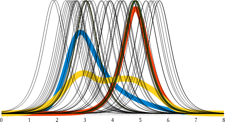 The thin black lines are the individual model ECSs and the other two thick colored lines are Sherwood (blue) and Hansen (red).
Interestingly, the yellow curve has a similar two-humps shape as the curve I got from just adding Sherwood and Hansen, suggesting that there are two clusters of models: a cluster of cold models that is closer to the Sherwood ECS, and a cluster of hot models that is closer to the Hansen ECS. Notice also that the humps are of very similar height, so it isn’t the case that there is a strong majority of either hot or cold models. The median value of the yellow line is 3.7°C, so that means that the average of all these model ECSs suggests 3.7°C average global warming in case of a doubling of atmospheric CO₂. The 66% uncertainty range is 2.5~5.1°C, and the 95% uncertainty range is 1.6~6.0°C. These are huge uncertainty margins. That, as well as the line’s weird shape and the occurrence of two clusters of ECSs causing this weird shape, strongly suggests that climate sensitivity is still very much an open question.
(March 19) — According to a new paper,8 an alternative or additional explanation for the gap between ECS-based predictions of warming and observed warming has to do with sea-surface temperature patterns. This is important, as with an increase of the number of explanations for the gap, high estimates of ECS (i.e., hot models) become (much) more plausible.
If you found this article and/or other articles in this blog useful or valuable, please consider making a small financial contribution to support this blog, 𝐹=𝑚𝑎, and its author. You can find 𝐹=𝑚𝑎’s Patreon page here.
Notes
- Most recently in Tipping Points, Permafrost Thaw, and “Fast” Reduction.
- Steve Sherwood et al. (2020), “An assessment of Earth’s climate sensitivity using multiple lines of evidence”, Review of Geophysics 58.4: e2019RG000678.
- James Hansen et al. (2023), “Global Warming in the Pipeline”, Oxford Open Climate Change 3.1: kgad008.
- As I have been trying to do in the Stages of the Anthropocene — Revisited series, for example.
- There are others, but I don’t have the time to review those right now.
- From Greek ψῦχος, meaning “cold”. (I didn’t use “C” (for “cooling”) because “C” is already in use.) The “a.s.” subscript stands for “aerosols”, of course.
- It is, of course, entirely possible that I overlooked or misunderstood something in the paper by Hansen et al., but there are other possible explanations for this too-low-ness.
- Kyle Armour et al. (2024), “Sea-surface temperature pattern effects have slowed global warming and biased warming-based constraints on climate sensitivity”, PNAS 121.12: e2312093121.