(This is part 9 of the “Stages of the Anthropocene, Revisited” Series (SotA-R).)
The previous episode in this series explained a few problems of the last iteration of the model used to better understand feedbacks between climate change and socio-political and economic circumstances (i.e. “Model 4”). Additionally, in another recent post, I mentioned that the relation between atmospheric carbon and warming is probably better treated as linear, with time lag explaining the discrepancy between a linear equation and the current level of warming. Furthermore, that post also addressed the issue of tipping points (and other neglected feedbacks), leading to an improved assessment thereof as well. This, of course, necessitated an update of the model, resulting in Model 5. That model predicts that – if tipping points etcetera are taken into account – we might warm up the planet by 4.5°C with a 67% confidence interval of 3.3~6.5°C, which is significantly higher than the 3.7°C predicted by Model 4.
The main changes in Model 5 (relative to Model 4) are the following:
- A review of the various parameter settings based on the discussion thereof in the previous episode.
- Substitution of a linear equation for predicting average warming due to atmospheric carbon content, and the addition of a time lag (the length of which can be set by means of a parameter) between atmospheric carbon changes and warming effect. (Data suggests that this time lag is about 15 years. See the section “‘Direct’ Warming, Feedbacks, and Time Lags” here.)
- A different way of predicting the effects of tipping points (and other generally neglected feedbacks), based on the discussion thereof in Tipping Points, Permafrost Thaw, and “Fast” Reduction.
- A correction in the way probability distributions are applied to model outcomes. (These used to be applied “at the wrong place” – that is, after a model run, on the final outcome – but because improbably high warming has more disastrous effects and thus prevents further warming, the probability distribution is effectively much narrower and should be applied earlier (if possible) in the model.)
(The previous episode also pointed out that Model 4 with tipping points etcetera suggested a much faster rate of warming than the least unrealistic IPCC scenarios, and that this might be a problem for that model. This problem is related to the time lag issue, however. The full effects of tipping elements and other feedbacks tend to take much time. Sometimes this is a matter of a few decades, but some effects take centuries or even millennia to fully develop. Hence, the graphs that need to be compared are Model 4 without tipping points and the IPCC graphs, and those align almost perfectly. The new Model 5 even seems to be more conservative than the IPCC with regards to the rate of warming.)
What is still missing in Model 5 is demographics. This is something that should be added to improve the model’s (lack of) realism, but this is also very difficult. It would require reliable estimates of the effects on birth and mortality rates of drought, war, economic crisis, and so forth, for example. This may be doable, but what may not be feasible is realistically modeling migration (or at least not in a spreadsheet that works on a normal computer). Furthermore, adding demographics would also change almost every other aspect of the model. Perhaps, if I can come up with a way to simplify demographics without sacrificing realism too much, there will be a Model 6 some time in the (near?) future, but right now I don’t think this is (very) likely.
As in case of Models 4 and 3, results are obtained for different parameter settings. For this purpose. parameters are grouped as follows:
- CIW (Climate Impact of Warming) determines how quickly drought, heat, cyclones, and extreme weather respond to average global warming, and how severe the effects are. Low CIW means less drought, and high CIW means more drought, and so forth.
- SEI (Socio-Economic Impact of climate change) concerns the effects of drought, heat, cyclones, and extreme weather on civic unrest and economic growth, as well as the interaction between civic unrest and economic growth. Low SEI means that drought leads to less civic unrest and less economic damage; high SEI means more.
- MRC (Mitigation/Reduction and Carbon capture) determines how quickly and how fast we start reducing emissions, how much we invest in technology to reduce residual emissions, how much carbon capture (DAC) plants we’ll build, and how much reduction efforts and carbon capture are affected by economic crises and (civil) war. High MRC means fast reduction, a lot of carbon capture, and relative insensitivity of these efforts to circumstances. Low MRC has the opposite effects and no carbon capture at all.
The table below gives three numbers for each of the 27 combinations of low, medium, and high settings for these three groups of parameters. The first number is the approximate year in which carbon-neutrality will be reached. The second number is the part per million (ppm) of CO₂ equivalent in the atmosphere at that point. The third number is how warm it will get due to that amount of CO₂ in the atmosphere. So, for example, right in the middle of the table you can find the results of the scenario “medium CIW, medium SEI, medium MRC”: “2139, 567, 3.2”, meaning that carbon-neutrality will probably be reached around the year 2139, at which point atmospheric CO₂-e will be 567ppm, resulting in approximately 3.2°C of warming (with the usual uncertainty margins and other caveats).
| low MRC | medium MRC | high MRC | ||
| low CIW | low SEI medium SEI high SEI |
2196, 759, 5.3 2174, 639, 4.0 2116, 560, 3.1 |
2202, 677, 4.4 2152, 589, 3.4 2112, 535, 2.8 |
2225, 564, 3.1 2110, 518, 2.6 2084, 495, 2.4 |
| medium CIW | low SEI medium SEI high SEI |
2175, 702, 4.7 2140, 603, 3.6 2107, 542, 2.9 |
2182, 639, 4.0 2139, 567, 3.2 2101, 523, 2.7 |
2163, 541, 2.9 2098, 510, 2.5 2079, 491, 2.3 |
| high CIW | low SEI medium SEI high SEI |
2195, 645, 4.0 2124, 561, 3.1 2094, 515, 2.6 |
2160, 593, 3.5 2118, 537, 2.8 2088, 503, 2.5 |
2122, 521, 2.7 2086, 497, 2.4 2071, 481, 2.2 |
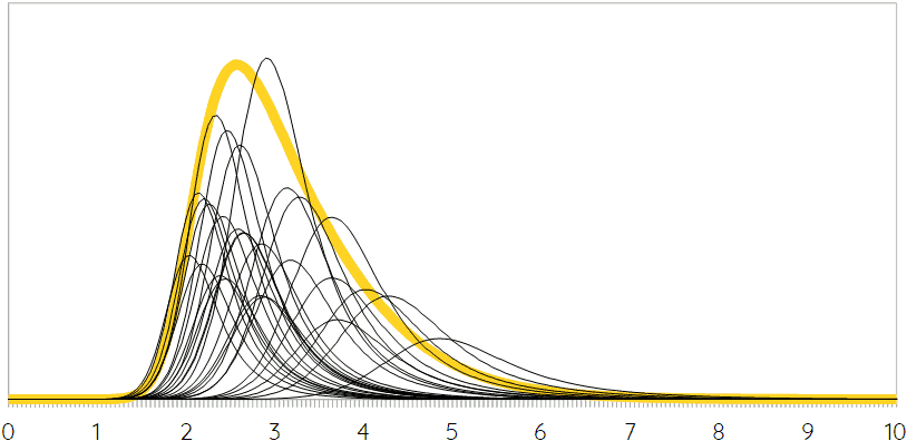
As before, these results can be combined by weighing them by their relative probability. The following graph shows the probability distributions of the various scenarios in the table above in black. The surface below those curves is proportional to the scenarios’ probabilities. The yellow curve is the combination of all of these 27 scenarios, but note that tipping points etcetera are not taken into account here.
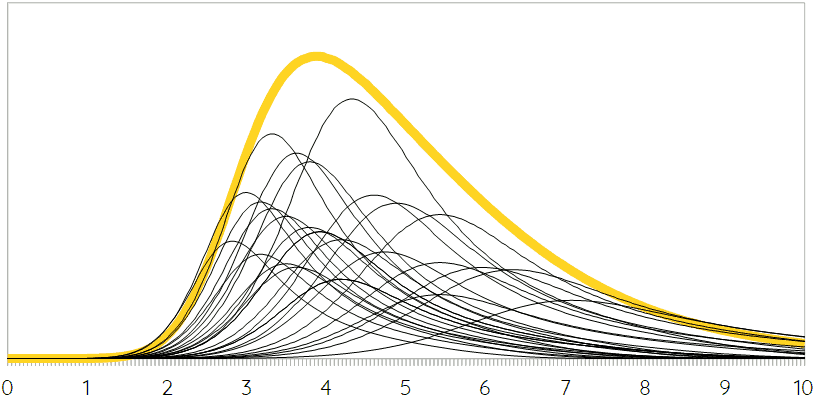
 As explained in a supplemental note to Tipping Points, Permafrost Thaw, and “Fast” Reduction, the average, probable effect of tipping points depends very much on whether AMOC collapse and Labrador/Irminger Convection collapse are included. Those tipping elements would have regional effects that are so severe that this would also affect the global average. However, for the rest of the world, these regional effects might not be directly relevant. If AMOC collapse and Labrador/Irminger Convection collapse are included, then tipping points etcetera more or less balance out and would just hugely stretch the uncertainty margins. If, on the other hand those two tipping elements are ignored (which is probably a more useful approach), then the following graph shows the probability distributions of average global warming for the 27 scenarios in the table above, as well as the combined probability distribution (in yellow).
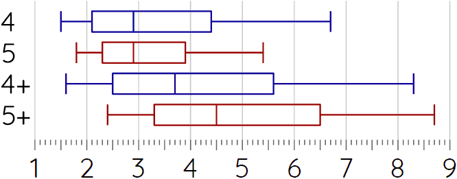
 It should be obvious that adding tipping points etcetera has two very major effects: it shifts the peak to the right (i.e. more warming) and it spreads out or flattens the curves (i.e. much more uncertainty). In numbers, Model 5 without tipping points etcetera predicts 2.9°C of average global warming with a 67% confidence interval of 2.3~3.9°C, and a 95% confidence interval of 1.8~5.4°C. With feedbacks it predicts 4.5°C, a 67% confidence interval of 3.3~6.5°C, and a 95% confidence interval of 2.4~8.7°C.
The following diagram shows these predictions and their uncertainty margins graphically, and compares them to Model 4. (The “+” means that tipping points etcetera are included. The blue bars are for Model 4; the red bars for Model 5.)
 It’s of course possible as well to combine all four of these probability distributions into one, which might be appropriate if there is no way to judge which of these four probability distributions is more (or less) realistic. This would give a median value of 3.4°C of average global warming, a 67% confidence interval of 2.4~5.3°C, and a 95% confidence interval of 1.7~8.0°C. To what extent this is really useful is debatable, but given the extent of uncertainty and the fact that it is very hard to say which of these approaches is the right/best one, we might opt for using this combined probability curve as some kind of handy summary of the modeling approach employed thus far. Surely, it seems a better option than picking just one of the four curves and going with that.
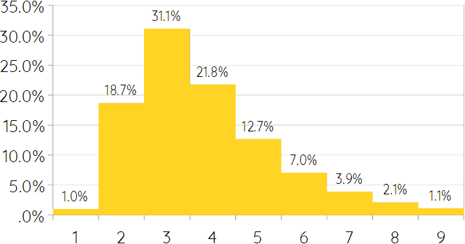
This combined probability curve can be converted into a convenient bar graph as shown below. Each of the bars in that graph shows the probability (according to this combination of 27 scenarios in 4 models/variants — i.e. 4×27=108 scenario variants in total) of a certain average level of global warming ±0.5°C. Hence, the third bar in the graph shows that there is a 31.1% likelihood of reaching an average global warming of between 2.5 and 3.5°C. (The percentages for warming below 0.5°C and above 9.5°C are 0.003% and 0.7%, respectively.)
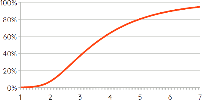
 Yet another way to illustrate the same thing is the following graph, which shows the probability of staying below a certain level of average global warming. There seems to be fairly widespread agreement that 6°C or more would probably make Earth pretty much uninhabitable for humans, or for anything approaching civilization, at least. The graph, however, shows that there is a 10% likelihood of exceeding that level. It also shows that there is a 62% likelihood of exceeding the already quite catastrophic level of 3°C.
 The aim of this series is to sketch the effects of climate change on the long run – that is, in stages 2 and 3 of the anthropocene.1 Obviously, given that the modeling approach employed here (to estimate the main outcome of stage 1) doesn’t give a clear single prediction, this means that there are (or should be) multiple scenarios for stages 2 and 3 as well. The question is what those scenarios should be. Perhaps, the most obvious approach is to divide the probability distribution into five “chunks” with a 20% probability each. Then the first 20% corresponds to warming of less than 2.5°C (median: 2.1°C); the second to 2.5~3.1°C (median 2.8); the third to 3.1~3.8 (3.4); the fourth to 3.8~5.0 (4.3); and the fifth 20% corresponds to warming of more than 5.0°C (median: 6.0°C).2 An option would be to take the second and fourth of these – let’s call them “LO2.8” and “HI4.3”, respectively – and treat these as two different scenarios. Ignoring the other chunks/scenarios because either they would be more extreme versions of LO2.8 or HI4.3 or in between, I could then just focus on trying to sketch stages 2 and 3 for these two scenarios. But there are other options, of course, and I’m also still thinking about developing a Model 6 that includes demographics, so nothing has been decided yet for the next episode(s) in this series.
If you found this article and/or other articles in this blog useful or valuable, please consider making a small financial contribution to support this blog, 𝐹=𝑚𝑎, and its author. You can find 𝐹=𝑚𝑎’s Patreon page here.
Notes
- Stage 2 begins when net artificial emissions of carbon and other (major) pollutants return to zero. Stage 2 ends and stage 3 begins when climate change processes that have been set in motion in stages 1 and 2 stabilize or become so slow that species and ecosystems can adapt to them.
- Other reasonable ways to divide the probability curve into five “chunks” result in very similar values for the second to fourth “chunk”. The median for the second might decrease to 2.7°C and that for the fourth might increase to 4.5°C, but that’s about the extent of change.