Last Thursday1 a new analysis of the main “tipping elements” in the Earth system was published in Science.2, 3 The paper and its supplementary materials provide data on likely thresholds and effects of all the main tipping elements that have been discussed in the literature of the past two decades. Furthermore, the supplementary materials also discuss a number of other feedback effects that have been suggested as tipping elements before, but that turn out to be too gradual to be properly classified as such. These effects are at least as important, however, and tend not to be (fully) included in common predictions of average global warming due to a change in atmospheric CO₂ and other greenhouse gasses either.
To give some examples, Armstrong McKay and colleagues predict that the best estimate for the threshold (i.e. the “tipping point”) for collapse of the West Antarctic Ice Sheet (WAIS) is 1.5°C (above pre-industrial – we’re at 1.1 or 1,2 now, depending on who you ask) with a minimum threshold of 1°C and a maximum of 3°C. It will take about 2000 years before the full effects thereof are felt (uncertainty range: 500~13,000 years), and these effects include 0.05°C of average global warming, 1°C of local warming, and an unmentioned rise in sea levels. (The latter is outside the scope of the paper, but can be easily found elsewhere.) For Amazon rainforest dieback, the estimated threshold is 3.5°C (min. 2°C; max. 6°C) with full effects in 100 years (50~200 years). These effects include further global warming between 0.1°C and 0.2°C degrees depending on whether the dieback is partial or complete, and 0.4~2°C locally.
Not all tipping elements are positive feedbacks, like these two examples, however. Changes in currents in the (northern) Atlantic ocean will have negative effects. A collapse of the Atlantic Meridional Overturning Circulation (AMOC) would lead to approximately 0.5°C of global cooling and local cooling effects of 4 to 10°C. The best estimate for the threshold of AMOC collapse is 4°C (1.4~8°C), so this is merely a relative cooling effect – everything else being equal, it would only reduce that 4°C of warming by 0.5°C.
Furthermore, not all tipping elements are equally important if we’re just concerned with temperature predictions. For example, coral reef die-off is estimated to occur at 1.5°C (1~2°C), but is not expected to have any (direct) effects on global or local temperature.4 The aforementioned WAIS, but also the collapse of the Greenland ice sheet are “irrelevant” for a very different reason: the timescales of their effects are so long (and their warming effects so small) that by the time full effects are reached average global temperatures will already be significantly lower than at their peak, so no additional warming – relative to that peak level – occurs.5 In temperature predictions, such tipping elements can, therefore, be ignored. That doesn’t make these tipping elements any less relevant in other ways, however. Melting of WAIS and the Greenland ice sheet will result in average global sea level rise of somewhere between 12 and 17 meters (but this will probably take about 10,000 years, although the minimum timescale estimate is a mere 1000 years).
As mentioned, in addition to tipping elements, Armstrong McKay and colleagues also discuss a number of other important feedback effects that turn out not to be tipping elements strictly speaking (mostly in the “supplementary materials”). By far the most important of these are weakening of the global land carbon sink and gradual thaw of the boreal permafrost. These two feedback effects are expected to kick in at around 2 and 1.5°C of average global warming, respectively, and to contribute 0.13°C and 0.21°C per degree of warming. Furthermore, abrupt permafrost thaw (which is classified as a tipping element) adds another 0.11°C per degree of warming. These three feedbacks dwarf all of the tipping elements, especially at levels of warming above 4°C,6 although the two permafrost thaw effects decrease by 21% for every degree of warming.
The question I am most interested in is how much additional warming we can expect due to these tipping elements and feedback effects. That, however, is not so easy to say. The data isn’t provided in a form to readily infer this, there are very many uncertainties and some of those aren’t quantified, making it hard to combine the data, and even if everything would be quantified, the statistical technique required to combine all of the tipping elements and feedbacks into a single probability plane (some Monte Carlo-based technique) is not something my laptop can handle. (And neither do I have such specialized software.) That doesn’t stop me from trying to get some usable prediction by means of some shortcuts, of course. If you’re dealing with many risks that are of comparable size, then you can just sum the products of the probabilities and effects of all of these risks to get a decent estimate of the overall risk you’re dealing with. (In this case, this has to be repeated at very many different levels of warming, but that’s easy in a spreadsheet.) It’s not really appropriate to use this shortcut here, but it gives a rough indication, at least, and by fluctuating thresholds and effect sizes, some indication of uncertainty ranges can be gathered as well.
Probably the most obvious finding resulting from this exercise is that tipping elements may be relatively insignificant if we’re interested in temperature alone, because they appear to cancel each other out. In a model that combines central estimates, the maximum combined effect of all tipping elements (in that model) is +0.34°C.7 However, the uncertainty margins are large. If cooling effects don’t occur at a level of warming actually reached, while tipping points with warming feedbacks are crossed, then the combined additional warming effect can be much larger. But it can also be the other way around, resulting in an aggregate cooling effect! Furthermore, because tipping elements seem to balance out on average (again, ignoring non-temperature effects), the other feedback effects appear to be far more important. Permafrost thaw alone accounts for 0.33°C of extra warming per degree (above a threshold, which is probably somewhere between 1 and 1.5°C), even if this effect gradually declines with further warming (21% per degree).
The thing with feedbacks is that they feed back. (Duh…) Let’s say that we warm up the planet by 3°C. Tipping elements and other feedbacks might add 0.47°C to that (but remember that this is just an average derived by means of a very simple procedure and that there are sizable uncertainty margins. That means that total warming would not be +3°C, but +3.47°C. However, at 3.47°C, tipping elements and other feedbacks would add approximately 0.63°C. This is not correct, however, because 0.47°C of that 0.63°C would already be added, so it would lead to a further increase of 0.16°C at most, but that further increase would again raise the total temperature increase leading to further feedback and a possible “tipping cascade”, in which crossing one tipping point leads to enough warming to trigger other tipping elements. Modeling such a tipping cascade and/or feedbacks on feedbacks would require running very, very many models and calculating the probabilities for all of them. This could be done on a supercomputer, but not on a laptop, so we’ll have to do with a simplification. Let’s say that tipping cascades and feedbacks on feedbacks only lead to 75% of the first level of extra heating at most. So, in case of the example above, then these effects would add 0.12°C.
A graph of the result of these calculations looks rather boring (so I won’t show it here). The extra warming line stays flat at 0 until 1.7°C of average global warming, after which it slopes upward in a gentle, almost straight curve, passing +1°C at 4.4°C of average global warming. The uncertainty margins are huge, however, especially above 6°C of average global warming. If equatorial stratocumulus cloud breakup would occur, which is a hypothetical possibility at very high levels of warming, this might add another 8°C of warming. (According to Model 4 in the SotA-R series there is a 10% probability of reaching 6°C. Several other models, including IPCC models, suggest similar probabilities. Hence, while such extreme warming is unlikely, it is certainly not impossible.) And the resulting 14°C or more of warming would trigger further tipping elements that are normally not considered as all. (But again, this is quite unlikely.)
The foregoing implicitly assumes a geographical averaging out of the effects of tipping elements (and other included feedbacks), but that assumption is mistaken. (Which I already knew, but ignored.) In case of the two tipping elements with significant negative effects on average global temperature, AMOC collapse and Labrador/Irminger Convection collapse (–0.5°C each), the ratio between expected regional effects and average global effects is between 6 and 20. What this effectively means is that these two tipping points – if they are crossed – might have severe effects in limited areas (Europe and North America, specifically), but have no important direct effects on the rest of the world. For that reason, their effects on the global average may be misleading. If those effects are ignored, the picture changes rather drastically, however, as the following graph illustrates.
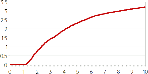 This graph shows additional warming (y-axis) due to tipping points and aforementioned other feedbacks in response to direct warming (x-axis) caused by us. (The graph includes cascades according to the method mentioned above, but ignores equatorial stratocumulus cloud breakup.) Hence, it suggests an “average” additional warming of 0.7°C (with very large uncertainty margins) if we warm up the planet by 2°C. And +1.4°C in case of 3°C. But notice (again) that this “average” ignores the cooling effects in parts of Europe. In case of Labrador/Irminger Convection collapse these might be sufficient to offset global warming (but not the other climate effects thereof such as drought and other extreme weather!); in case of AMOC collapse these may even freeze Scandinavia. (Unfortunately, this refreezing of part of the Arctic would almost certainly not help much to stop the Greenland Ice Sheet from collapsing, as melting thereof will continue if it falls below a certain height, even if temperatures drop.)
“Direct” Warming, Feedbacks, and Time Lags
Before adding these indirect effects of warming through feedbacks and tipping points to the function that relates warming and atmospheric carbon, let’s have another look at that function first. In CO₂ Emissions and Global Warming, I wrote that a linear function cannot get both the historical data right and pass through the 3.1°C at 560ppm prediction of the generally accepted “climate sensitivity” measure,8 which lead to the following non-linear equation:
However, as far as I can see, it is typically assumed that the relation between atmospheric carbon and “direct” warming (i.e. before tipping points etc. are taken into account) is (close to?) linear, and therefore, this equation may not be a good approximation. Furthermore, there is another explanation to solve the problem of the discrepancy between historical data and a simple linear function. Such a simple linear function would be a line that passes through the point where axes cross (i.e. 0°C/280ppm) and through the 3.1°C at 560ppm point. Hence,
According to this equation, we should be at 1.5°C of average warming right now, but we’re only at 1.1 or 1.2°C, which should have been reached at approximately 385ppm, the atmospheric carbon level of 2008. Hence, if this equation is right, we’re almost 15 years behind, or in other words, there is a 15-year time lag between carbon emissions and their full direct effect. If this is right, that also means that even if we would stop all emissions right now, we’d still reach 1.5°C in the mid 2030s. It would also mean that socio-economic feedbacks would work much slower, which might imply more emissions before cascading collapse would significantly reduce or even end them. This is something a future Model 5 in the SotA-R series needs to address.
If we accept the simple equation for direct warming effects due to atmospheric carbon, then the results of the calculations about tipping points and other feedbacks (permafrost thaw and land carbon sink weakening mainly) can be added to those, resulting in the following graph:
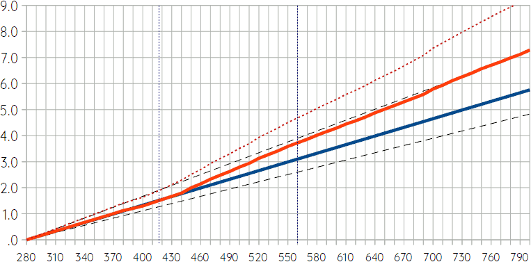 The dark blue line is the equation given above, predicting 3.1°C at 560ppm and 1.5°C at the current level of roughly 417ppm. Dashed black lines are the 66% uncertainty margins according to the climate sensitivity metric, assuming that those are linear and pass through 0/280 as well. The orange-red line adds tipping points and feedbacks, which only start to kick in after 440ppm or so, but which add 0.6°C at 560ppm. Uncertainty margins are much wider for the red line. Given the way this additional warming is derived from the available data (see above), it’s impossible to specify those exactly – the red dotted line is merely an approximation of what a reasonable upper bound of the uncertainty margin might be. That is, higher than the red dotted line is (probably?) unlikely.
It is important to realize that there is a further time lag between the dark blue and orange-red lines. As mentioned, the time lag between reaching a certain atmospheric carbon level and the full direct warming effects as shown by the dark blue line might be approximately 15 years. However, reaching the full indirect effects of tipping elements and other feedbacks as shown by the orange red-lines takes at least a century and probably even two or more.
Fastest Possible Emission Reduction
Now, let’s apply these new data and calculations to a scenario, but let’s use a relatively simple scenario for that purpose (so no complicated model), namely the scenario of the fastest (economically/financially) possible carbon emission reduction. In this scenario, it is assumed that every carbon-emiting piece of machinery or infrastructure is replaced by a carbon-neutral variant at the end of its normal economic life time. Replacement before that time is hypothetically possible, of course, but not financially feasible. Companies, governments, and rational individuals base their financial plans on the normal expected life spans of infrastructure/machinery they use, and thus, won’t have saved up enough money for replacement at an earlier point in time. (For each economic sector, data on emissions, normal life spans of factories and other relevant emitters, and so forth can be found on the Internet.) The scenario further assumes that residual emissions – that is, emissions from “things” for which no (scalable) carbon-neutral replacements are available at the current state of technology – decrease by at least 1.5% per year due to significant investment in technological research and development. It should be noted that these assumptions are quite unrealistic as we are still investing in polluting infrastructure (such as oil pipe lines, coal power plants, and diesel trucks) and are obviously not yet systematically replacing “things” with carbon-neutral alternatives when they need replacement. Furthermore, the speed of technological development required for this scenario is far beyond anything we have seen throughout history.
The scenario further assumes socio-political stability, so no societal collapse or widespread civil war. This too, is quite unlikely, as increasing drought and natural disasters will undoubtedly have significant socio-economic and political effects. Finally, the model assumes stable economic growth of 3% per year, which is a bit below what we’ve been used to in the past decades, and which is very unrealistic for the same reason. For comparison, I did the same calculation for a scenario with no economic growth at all, and for a scenario that starts with economic growth, but in which there is a gradual decline. The following graph shows emissions and average global temperatures before tipping points and feedbacks (but after the 15-year time lag mentioned before) in these three scenario variants. (Explanation below the figure.)
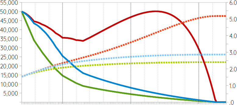 The dark red line shows yearly emissions (left y-axis) for the variant with economic growth. The red dotted line shows global average temperature anomaly (i.e. average global warming; right y-axis) for this variant. It reaches a maximum of 5.2°C (after time-lag / before feedbacks), which would result in 6.6°C if feedbacks are included. The time period presented in the graph is from 2020 to 2170. (Gray dotted vertical lines for every decade; black dotted lines for 2050, 2100, and 2150.) Hence, the peak of 5.2 in the graph is close to 2120, but would be a bit later in reality due to time lag, and it would take another two centuries or more for the full effect of the feedbacks. (But note that at 6.6°C of warming there may be a tipping cascade resulting in significant further warming, and that there would be all kinds of regional effects and non-temperature-related effects complicating the picture. A collapse of the AMOC, which is likely at this level of warming, would have a cooling effect in parts of Europe and North America that might even compensate warming, for example.)
The blue and green lines represent the scenario variants with economic decline and no economic growth, respectively. In the economic decline scenario variant maximum warming before feedbacks is 2.9°C resulting in 3.4°C after feedbacks and tipping elements kick in. In case of the no-growth variant, these numbers are 2.4 and 2.8°C, respectively.
These are not realistic scenarios, of course, but they do serve a purpose. The red lines in the graph represent the most optimistic peaceful scenario of emission reduction. It avoids societal collapse and economic crisis, and assumes massive investment in research and development and a global effort to replace all emitting infrastructure and machinery as soon as financially possible. Even then, it would take until the 2160s to reach carbon neutrality, and we would heat up the planet with more than 6°C (with the usual uncertainty margins), which would make much of the planet uninhabitable. What this shows is how outrageously unrealistic typical scenarios used by climate scientists are. The SSPs used by the IPCC are nonsense. And so is the idea that carbon neutrality by 2050 (or even 2070) is possible (and sufficient to avoid disaster).
We probably won’t reach 6°C of average global warming. The extent of “natural” disaster at 2°C or 3°C will already be sufficient to cause a cascade of societal and economic collapse. If our descendants are lucky, this collapse will be fast enough to leave a partially habitable planet.
If you found this article and/or other articles in this blog useful or valuable, please consider making a small financial contribution to support this blog, 𝐹=𝑚𝑎, and its author. You can find 𝐹=𝑚𝑎’s Patreon page here.
Notes
- September 8, 2022.
- David Armstrong McKay, Arie Staal, Jesse Abrams, Ricarda Winkelmann, Boris Sakschewski, Sina Loriani, Ingo Fetzer, Sarah Cornell1, Johan Rockström, &Timothy Lenton (2022). “Exceeding 1.5°C global warming could trigger multiple climate tipping points”, Science 377, eabn7950.
- The term “tipping point” is probably better known than “tipping element”, but often used incorrectly. “Tipping point” refers to the threshold at with a tipping element switches (or starts to switch) from one state into another.
- There is broad consensus, by the way, that this tipping point will be passed and that corals will go virtually extinct in the middle of the current century.
- Due to natural effects, the average global warming that we are causing will gradually decrease. It will take very long before all the CO₂ we put in the atmosphere is sequestered, but other greenhouse gasses are less stable.
- With one exception: equatorial stratocumulus cloud breakup, which might occur at warming levels (well) over 6°C might add another 8°C and create a hothouse state killing almost everything. There is only one study suggesting this possibility, however, so confidence levels about this possible tipping element are very low.
- With the same hypothetical exception mentioned before: equatorial stratocumulus cloud breakup might add another 8°C at very high levels of average global warming, but this is very uncertain.
- Steve Sherwood et al. (2020), “An assessment of Earth’s climate sensitivity using multiple lines of evidence”, Review of Geophysics 58.4: e2019RG000678.