[(This is part 9 of the “Stages of the Anthropocene, Revisited” Series (SotA-R).)
The latest iteration of the model I have been developing in this series in an attempt to predict how much carbon we are going to emit in stage 1 of the anthropocene1 predicted that we’ll heat up the planet by about 3.3°C (67% interval: 2.3~5.0°C), and that this will imply (or involve) widespread famines, civil war, refugee crises, and societal collapse. Rather than take that prediction for granted, it seemed a better idea to compare this prediction with some other predictions, and to have a closer look at some other aspects of the model’s prediction as well. It turned out that this was a good idea indeed, as it lead to the discovery of another error in the model. After fixing that, the corrected prediction is 3.7°C (67% interval: 2.5~5.6°C). I have since updated the previous episode in this series to change all numbers to the predictions of the corrected model.
In this article, episode 9 in the series, I will briefly explain the error (and how I found it), but the main objective of this episode is to critically reflect on the model, to compare its predictions with a few other predictions, and to discuss what is missing and/or could be improved.
A Small Mistake with Big Consequences
One way of assessing the realism of the predictions of model 4 is to have a closer look at what it predicts with regards to civil unrest and economic growth/decline, the two most important variables in the model. Below is a map of the levels of unrest predicted by 2050 in the middle-of-the-road scenario that was closest to the combined prediction of the suite of scenarios described in the original version of the previous episode in this series. I didn’t add a map key as the quantified unrest rates are meaningful only within the model. Red and dark red countries on the map have unrest levels above the threshold for civil war or societal collapse (in the model). What surprised me most about this map is that most of Europe and southern Africa are green, meaning that they have the lowest unrest levels. (But there are many other surprises as well. Mexico is only yellow? Japan has a higher unrest level than Chile? …)
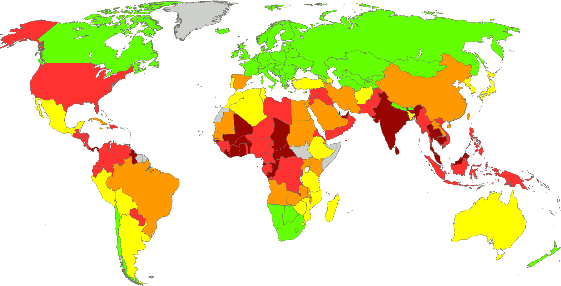
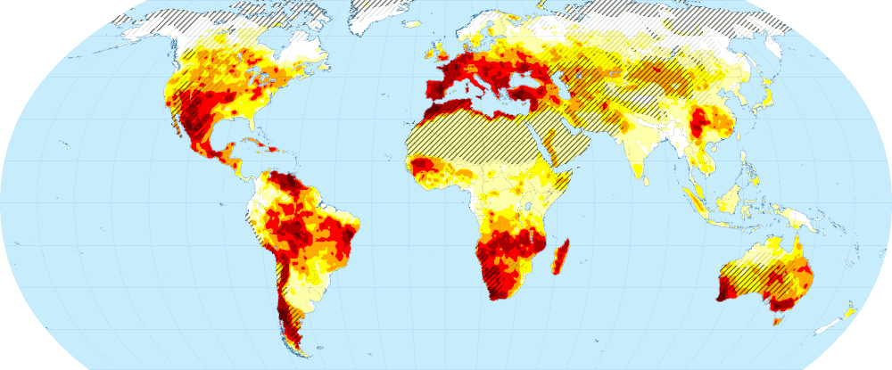
Unrest is determined by a number of factors including drought (leading to water shortages, famines, rising food prices, and/or food riots), economic decline and crisis, natural disasters, high unrest in neighboring countries (leading to an influx of refugees), and socio-cultural factors. As mentioned repeatedly throughout this series, drought is probably the climate impact with the biggest social, economic, and political effects, and the model takes this into account. The correlation between civil unrest and drought in 2050 is 0.96 (which is probably too high – more about that below). However, if you look at the drought map at approximately 2°C of warming in episode 2 of this series, then it becomes clear that the above map of civil unrest cannot be right.
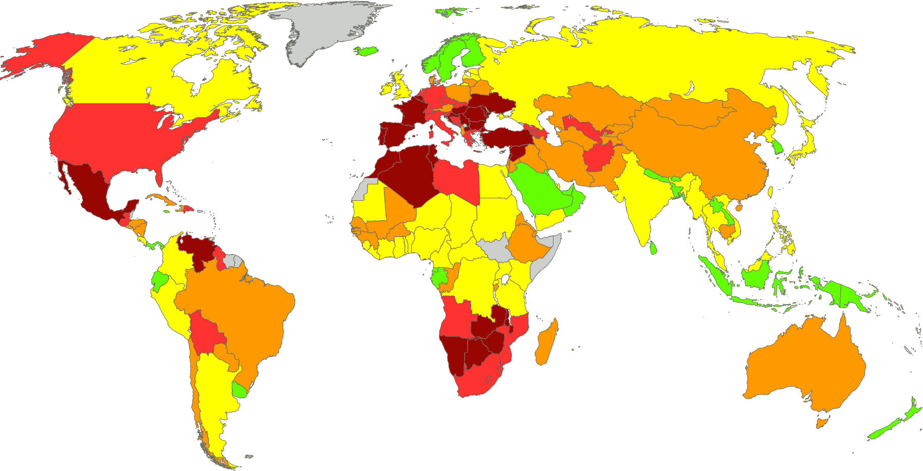
So, something must have gone wrong somewhere in the model. After a bit of searching, I found that I accidentally switched the indices for drought and heat effects at one place. (This was really just a matter of inputting the number “27” where it should have been “26” and the other way around in some “vlookup” functions. Aaargh!) Fortunately, this was easy to correct. Keeping all other settings identical and running the same suite of scenarios produced the updated predictions that can now be found in the corrected version of the previous episode. It also lead to the following updated map of civil unrest in 2050:
Tweaking Parameters
This updated map of civil unrest in 2050 looks much more like the drought map indeed, but that might indicate another problem: the model may overestimate the impact of drought. (As mentioned, a correlation of 0.96 is really improbably high.) While it may very well be the case that France is going to have a serious drought problem later this century, I find it hard to believe that this will already be so bad by 2050 that it will have resulted in societal collapse or civil war. On the other hand, the model also takes into account that there will be large numbers of refugees from Spain and North Africa, which will experience even more severe drought (and even earlier), and that will certainly also be a major destabilizing factor.
Moreover, I find it equally hard to believe that Indonesia, Sri Lanka, India, Gabon, and several other countries that are green or yellow on the map will be virtually without social problems. India is already baking, and Indonesia is expected to suffer from crippling heat by 2050. The expected heat levels for these countries are such that this must have serious economic impacts, which have other social impacts in turn. It may be the case, then, that at current model settings the impact of drought is too large (and/or too soon), while the impact of heat is too small.
This can easily be changed by changing a couple of parameters, but before I can test any tweaks like this, we need a baseline. That baseline is the aforementioned middle-of-the-road scenario that leads to 2.9°C warming by 2100 before hard-to-predict feedbacks and tipping points, which is the same number as in the combined prediction of model 4. Adding those hard-to-predict feedbacks and tipping points raised that number to 3.7°C, mainly by creating a much fatter tail on the right-hand side of the graph – that is, by increasing the (still very small!) likelihood of extreme temperature increases due to Amazon forest die-back, permafrost melting, ecosystem collapse, and so forth. (Notice that the peaks in the graphs – that is, the temperature increases with highest probability – are 2.4°C and 3.0°C for the versions without and with these feedbacks/tipping points, respectively. Hence, the peaks are closer together than the median values, which is a consequence of the fatter tail for the second. This is also illustrated by the difference in the upper limit of the 95% confidence interval: 6.7°C and 8.3°C, a 1.6°C difference!)
So, let’s try a couple of tweaks. If the impact of drought is slower – meaning that the 2°C drought map shown above is more accurate for 3.5°C of average global warming, for example – then the predicted temperature rises to 3.2°C by 2100 (+0.3°C). Substantially decreasing the parameter that determines the social impact of drought (mediated by famine, rising food prices, food riots, and so forth) has very similar effects. The explanation for these effects is a point that I keep making throughout this series: economic and societal collapse leads to a much more substantial decrease of carbon emissions than any peaceful means. (This isn’t just a hypothesis, by the way, but something we have already been seeing many times in practice. The economic collapse of Russia in the 1990s significantly decreased its emissions, for example. And so did the economic dip caused by the Corona virus.) Significantly increasing the economic effects of heat has the opposite effect for the same reasons. However, because the countries most affected by heat are relatively small carbon emitters, the overall effect is much smaller (approximately –0.1°C). Reviewing these various parameter setting of drought and heat (and their effects on predicted civil unrest) led to a new prediction of 3.0°C, 0.1°C higher than the baseline. This new prediction also involves substantially less and later socio-economic collapse.
There may be another problem, however. According to the model, in this scenario global economic growth becomes negative in or before 2040, and in the decade after that, the number of countries that experience severe economic decline or even collapse starts to grow rapidly. Through a number of pathways (poverty, insecurity, rising fascism, etc.), economic decline leads to an increase of civil unrest, but that is almost invisible in the model. Furthermore, capitalism cannot survive without economic growth (except for the occasional crisis), and according to the model, no country will be spared from economic decline. Given that the elites will not easily give up on the system that made them rich in the first place (except, perhaps, if they can replace it with a variety of fascism that serves their interests), this is likely to lead to further civil unrest or even civil war. Hence, the parameter that determines to social effects of economic decline is probably set (much?) too low. If it is set higher, the predicted temperature increase by 2100 drops significantly (–0.2°C or –0.3°C) due to an increase in civil unrest, which triggers further economic decline in extreme cases (i.e. in case civil unrest leads to substantial riots or even civil war).
There are other parameters that, on closer inspection, seem to have somewhat improbable settings. In times of economic crisis, spending on green technology is likely to drop more significantly than the “middle-of-the-road” setting suggests, for example. And that scenario is probably also much too optimistic about carbon capture from the atmosphere. After reviewing all of the parameters, and subtly changing several of them (which never led to more than a 0.1°C change in the prediction and usually much less), the end result was a prediction of 2.9°C by 2100. Hence, the same as the baseline I started with.
Comparing Predictions
The following graph compares five different temperature predictions for (part of) the 21st century. The black line is the prediction by Wangyang Xu and colleagues, which was published in Nature in December 2018.2 It is based on a combination of several other predictions, and seemed the best prediction available at the time, which is the reason why I have been referring to this prediction quite often in this blog. The grayish area surrounding the black line is its uncertainty margin. The green and blue lines are lifted from the latest cycle of IPCC reports (AR6, published in three parts in August 2021, February 2022, and April 2022). Green is the prediction for SSP3-7.0 and blue is the prediction for SSP2-4.5. These are just two of the models for which IPCC predictions are available, but as explained before, while all of the SSP scenarios are rather implausible, SSP2 and SSP3 have at least a modicum of credibility. The red and orange lines are the predictions of model 4 (with pink and yellow 67% uncertainty areas and orange overlap thereof). As mentioned, the difference between the two is that the red line takes some hard to predict feedback effects and tipping points into account (such as permafrost melting), while the orange line doesn’t.
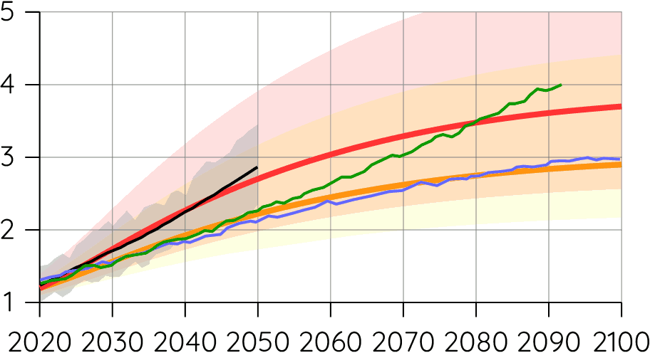
What surprised me the most about this graph is the huge difference between the black line (Xu et al.) and the blue/green lines (IPCC, AR6). Xu and colleagues predict approximately 2.8°C by 2050, while these IPCC predictions are closer to 2.2°C. I don’t know the explanation for this big difference, but the IPCC reports are generally considered to be the gold standard of climate change prediction, so we should probably assign higher credibility to the blue and green lines than to the black line.
There are at least two other things shown by this graph that are equal parts obvious and important. First, in the Xu and IPCC scenarios temperatures just keep rising. The reason why is this is the case is also the reason why I’m trying to build an economic-geographical model of emissions in the first place: the IPCC models and almost all other models don’t take social feedbacks into account. They take society, economics, politics, and so forth all as given and assume that climate change has no relevant social, economic, and political effects. That is, of course, nonsense, and modeling these feedbacks is exactly what I’m trying to do.
Extra warming due to tipping points etc. does not happen immediately. There are significant time lags here. Consequently, this cannot explain the steep slope of the red and black lines. These are probably too steep.
Second, model 4 before feedbacks/tipping points (i.e. the orange line) is almost identical to the two IPCC models in the graph, while model 4 with feedbacks/tipping (i.e. the red line) is very close to the prediction of Xu and colleagues. This raises questions about these hard-to-predict feedbacks and tipping points. To what extent did Xu et al. take effects into account that the IPCC ignores? What are the state-of-the-art predictions for the probability of tipping points, the temperatures at which they might occur, and their expected effects? The statistics I have been using for model 4 may be out of date already, so this is something I need to look into more closely when I have time.
Omissions, and Closing Remarks
The main omission (as mentioned before) is demographics. An earlier model related to climate change (described here and here) was essentially a demographic model: it modeled births, deaths, migrations, and so forth as dependent variables determined by natural disasters, the state of the economy, and so forth, but due to technical limitations, I could only do so for a small number of regions in an abstract model (i.e. not for very many countries will real geography). Ideally, I should do the same in the current model – that is, it should model refugee flows, death rates due to famine or extreme heat waves, and so forth. Much of that is not overly complicated, but migration (i.e. refugee flows) is extremely difficult to model. It would require several matrices with all countries in rows and columns for every year of the model (although this could potentially be simplified a bit), which would make the model so big that it would be impossible to run on my computer (and probably even on any home PC). But it would also raise complicated technical questions. I’d need an equation to determine where refugees go, for example, which would probably involve many variables and constants/parameters. Perhaps, some kind of simplification is possible – and that would already be an improvement – but whether it is indeed, and whether I can implement it are open questions for now.
It is possible, of course, that adding demographics will substantially change the outcome of the model, and it is also possible that a better assessment of tipping points etcetera would change the 3.7°C prediction. The various tweaks mentioned above seem to have less significant effects, on the other hand, although it is quite possible that they change some of the other scenario outcomes in the suite of scenarios used for the combined prediction (i.e. the aforementioned 3.7°C). Furthermore, it is probably a good idea to review the “high” and “low” settings used for these scenarios as well.
While some of the above considerations raise questions about the reliability of the 3.7°C prediction (67% interval: 2.5~5.6°C), for now it is still the best prediction available, I think. However, its uncertainty margins are huge (3.1°C between the lower and upper bounds of the 67% interval), which means that this prediction is almost useless for the main purpose of this series: trying to get a better grip on what happens next, in stages 2 and 3 of the anthropocene. But I don’t think that this is going to change either, even if I manage to improve the model, so perhaps, that implies that rather than developing one scenario for stage 2, I should develop four, namely, for 2°C (15% chance), 3°C (28%), 4°C (23%), and 5°C (15%) degrees of average global warming.3
That’s a rather silly response. If he had actually read my article, he would have understood that there is no such premise (and certainly not a “fundamental” one). It is essentially a demographic model and it doesn’t assume a certain birthrate, but rather it predicts an increasing birth rate. It makes that prediction for reasons that are the mirror image of the reason why the birth rate is now declining (as Walker correctly observes). Birthrates are rapidly decreasing due to better education for girls, increasing access to anti-conception, decreasing poverty, and so forth. But many of the factors that lead to decreasing birth rates now are expected to be absent or decreasing in the future for significant numbers of people. By means of a regression analysis, one can find the relation between the birthrate and economic and social factors such as those mentioned. That’s exactly what I did, and it is based on the results of that regression analysis that the model predicts and increasing birth rate. There will be less access to education (especially for refugees!), less access to anti-conception and other relevant health care, more poverty, more rape (in war zones etc.) and all of those (and other) factors will lead to a small increase in the birth rate. That’s what the model predicts; not what it assumes.
If you found this article and/or other articles in this blog useful or valuable, please consider making a small financial contribution to support this blog, 𝐹=𝑚𝑎, and its author. You can find 𝐹=𝑚𝑎’s Patreon page here.
Notes
- Stage 1 is defined as the period of the anthropocene that ends when artificial carbon emissions return to a geophysically negligible amount. See the series introduction.
- Wangyang Xu, Veerabhadran Ramanathan, & David Victor (2018). “Global Warming Will Happen Faster than we Think”, Nature 564 (6 December 2018): 30-32.
- These probability percentages give the probability of an average global temperature increase of the given number plus or minus 0.5. Additionally, according to the model, there is 2% chance of an increase below 1.5°C, a 8% chance of 6°C (with the same 0.5 margins), and a 10% chance of an increase above 6.5°C.